Single line graph:
The graph describes/shows/reveals/..... It can be clearly seen that....
Vocabulary:
rise/increase/climb/goes up
decrease/decline/drop/goes down/
doesn't change/remains at the same level/maintain stability.
peak/bottom
fast/rapidly/quickly
slowly/gradually/steadily
A rise was preceded by drop
followed by decline
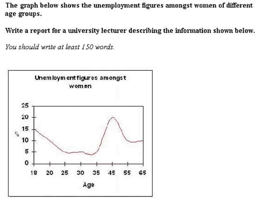
The graph shows the jobless ratio of various group of female which range from 18 to 65 years old. It can be clearly seen that the age group of 45 possesses the highest unemployment ratio.
According to the graph, between the age group of 18, 20, 25 and 30, the youngest group has the most highest unemployment quantity (15%). This number in the group of 20-year-old female is 1,5 times lower than that of the youngest group. And this decrease is even lower to approximately 5% for 25- and 35-year-old group. There is a slight rise with the group of 30 year old, where the umployment rate reaches about 6 percent.
The peak is reached with the group of 45 year old women, and all the remaining groups have the lower figures: 8% at age 55 and 9% at age 65.
In conclusion, the numbers of most of the age groups vary from 5 to 9% the the exceptions of such groups of 18 and 45.
No comments:
Post a Comment